Award-winning Art Direction and Design.
Ensure evolution, not revolution - honour our heritage but speak to where we are today.
Based in Cape Town, CREMA is South Africa’s premier destination for the world’s best luxury interior design.
They were looking to upgrade their identity to mark their 20th anniversary and beginning of a new chapter, which includes a brand new showroom in a restored 19th century warehouse.
As the brand has been building a significant reputation with their trusted client they were keen to keep consistency. This meant keeping a type-based logo, but elevating the typography used.
This resulted in an elegant and refined logotype that speaks to the quality and beauty of the items they stock as well as their European origin (as most of the brands they carry come from the UK, Italy and Denmark). It was also imperative that the logo would be able to hold it’s own when featured next to these brands in their marketing communications.
Building a trusted global leader in evidence-based psychological wellbeing.
I was approached by Bloomfield Health to forge an identity for a mental wellness brand which would need to work across multiple platforms and functions including a practice of world-leading practitioners and ai-driven mobile app.
The branding had to convey first-class service from science-backed experts, but also needed to be approachable, friendly, inclusive and warm.
The result is a mark of overlapping geometric circles that are meant to invoke the shape of stylised flower petals signifying personal growth and improvement representing a harmonious union. The clean, classic sans serif typeface has been for the logotype, set in all caps to add an air of authority, without feeling too austere. A warm and soothing colour palette illustrates the personal touch of the brand (and to stand out from cold, clinical competitors).
Involved with everything from naming through to the identity design and execution of the website, stationery, social media templates and design of the mobile app called UVIA, I continue to consult them on all of marketing communications.
Sylvia Plath reading Butt Magazine.
Fourteen Poems is a quarterly journal showcasing the best of LGBT+ contemporary poetry.
The founder, Ben Townley-Canning, provided me with a great brief which boiled down to ‘imagine Sylvia Plath reading Butt Magazine.’
The result is a modern take on Gilbert Baker’s pride flag, utilising a colourful, soft pastel palette paired with bold typography.
In order to allow the poetry to take center stage, the Ben and I agreed to exclude imagery from the identity and printed book. I chose a classic serif typeface to set the book in and add gravitas to the publication.
This project is close to my heart as it provides a platform to young and marginalised artistic voices.
Unpack the creative process with a sense of play, a ’sandbox’ experience of exploration and fun, all driven by a passion for creativity.
Oscar and Bafta award-winning film production studio See-Saw approached me to create an identity for their first venture into podcasting called The Sandbox.
The challenge was to create a look and feel that was elegant and purposeful as well as embody timeless creative curiosity that is integral to all of the work they do.
The result was bold typography paired with a geometric marque made of two semi-circles. The segments, which have a textured appearance represent the collaborative nature of film making, that each individual brings their unique expertise to create a whole. Textures and soft colours were used to reference their British and Australian pedigree and represented a sense of approachability, which is an essential element of their brand.
Celebrating openness and inclusivity without the clichés
We were commissioned by the organisers of Waltham Forest Pride to create an identity that would appeal to this diverse community’s LGBTQ+ residents, friends, and families.
A playful, hand-drawn typographic mark with informal painterly shapes to emphasise the friendly and approachable nature of Waltham Forest Pride. Multi-coloured rays surround the lockup, representing how this event is diverse and engaging, illustrating ‘reaching out’ into the community. These colours are a nod to the Progress Pride flag, without seeming too cliché. The logotype sits on a circular form, creating a badge one can wear with Pride.
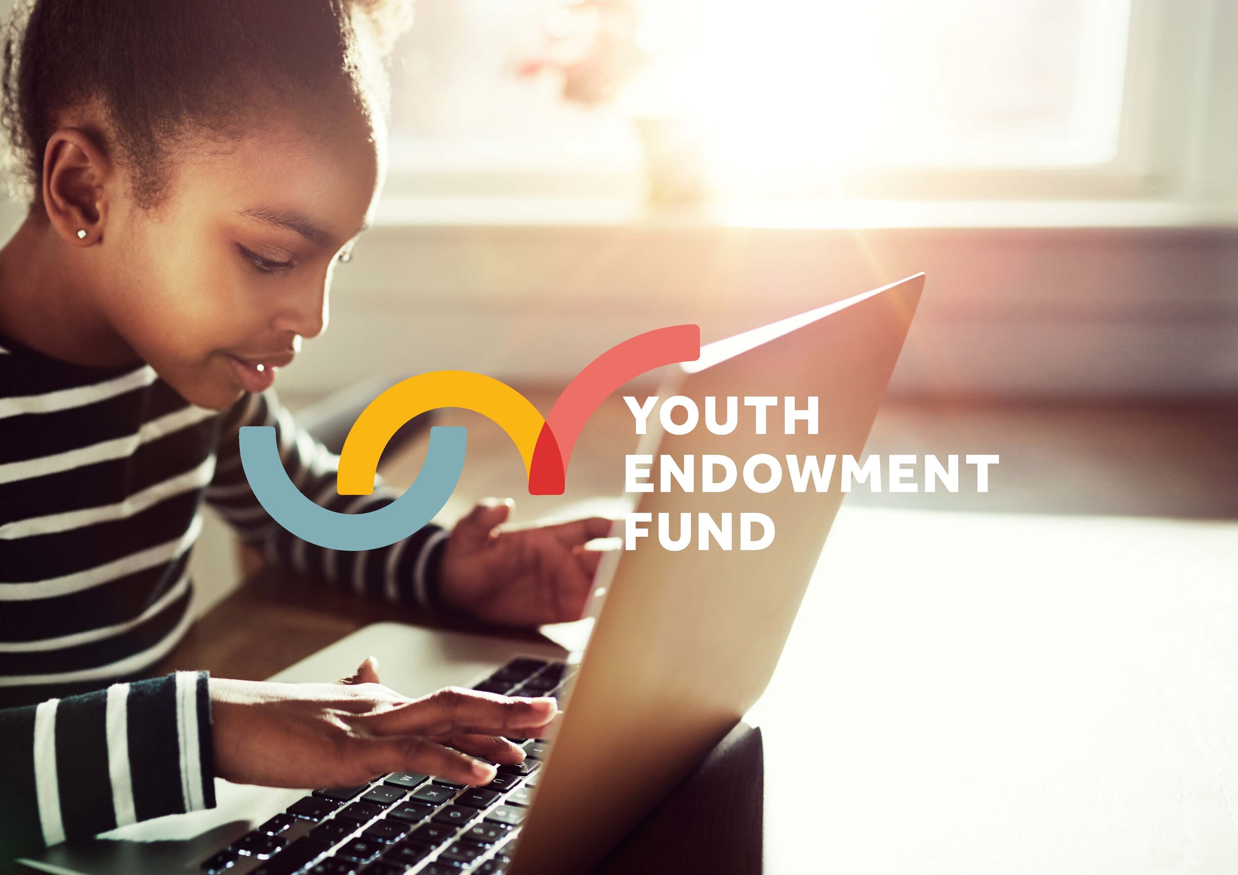
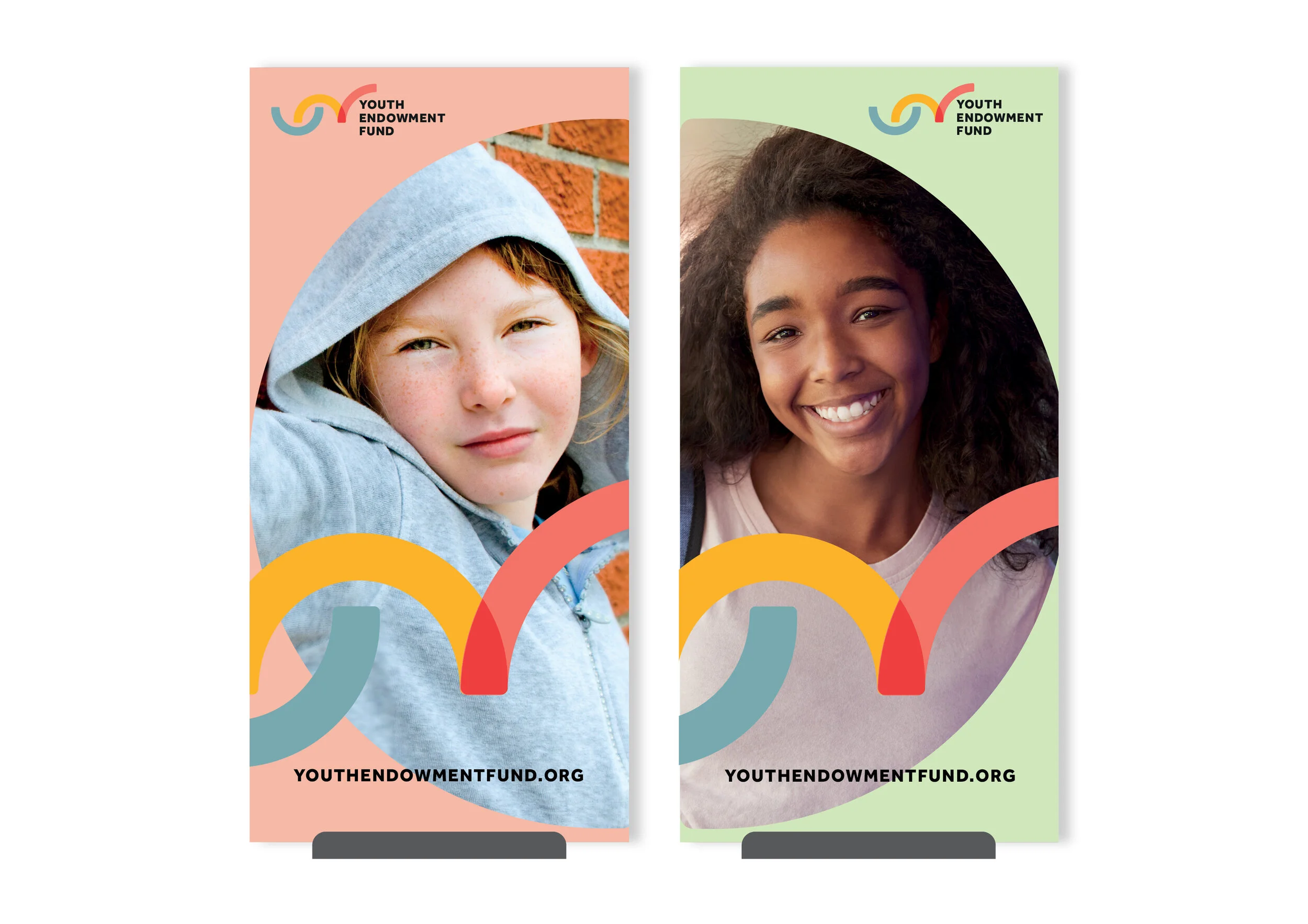
Early intervention is the key to breaking the cycle of youth offending.
The Youth Endowment Fund provides grants to organisations who put early intervention at the heart of efforts to tackle youth offending. Aiming to support at-risk children and young adults as young as 12, the brand personality has the triple tenets of credible, collaborative and brave. The Youth Endowment Fund is comprised of three separate organisations; Impetus, Early Intervention Fund and Social Investment Business, and the identity would have to sit on it's own as well as alongside the partner logos.
I designed a unique and memorable motif which consists of a geometric brand mark comprised of two semi and one quarter circle. From left to right, the first semi circle lays concave and that the curvature is aligned to the base line. This, combined with a sombre blueish-grey colour, represents a negative cycle that seems predetermined. The next semicircle, in yellow, represents a disruption to that cycle by an early intervention and offers hope and optimism. The quarter circle intersects the yellow shape, in a bright and positive coral red. This indicates that the cycle is broken and a new path is formed.
These shapes have been rendered with soft edges to keep the look friendly and approachable, yet credible. This motif was then used across all of the communication touchpoints to create a cohesive identity.
I worked in conjunction with Hillcrest (strategy) and Upwards Group (technical development).
Improving outcomes for young people and delivering societal benefits.
The Youth Futures Foundation is an independent, not-for-profit organisation with an aim is to improve employment outcomes for young people from marginalised backgrounds. With a £90m endowment, their goal is to improve young people’s employability and look at systemic barriers.
Youth Futures Foundation positions itself as innovative, bold, forward thinking, yet authoritative and results driven. The brand needed to feel fresh, modern and have the flexibility to appeal to a number of different stakeholders including practitioners, employers and policymakers.
A bespoke logotype featuring geometric letter shapes was developed alongside bold, colourful patterns and illustrations to create a dynamic and memorable identity.
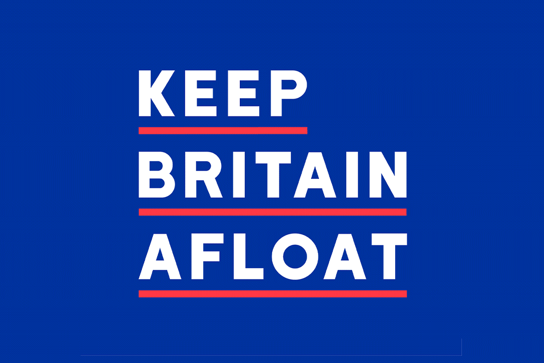
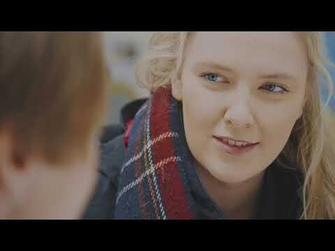
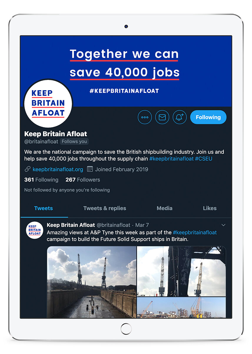
An integrated political, social media and PR campaign that put British shipbuilding at the heart of the Government agenda.
Shortlisted: The Babcock International First Sea Lord’s Award for Best Use of Digital Media - Maritime Foundation
Launched in May of 2019, the campaign featured video interviews of a wide range of employees from several shipyards across the country sharing personal stories which detailed the impact of plant closures. This inspired thousands of people from around the UK to put pressure on the defence secretary to change the process and save thousands of jobs. Because of the nature of the campaign, we wanted to avoid political rhetoric and appeal to all Britons sense of community regardless of background or ideology.
I co-created the concept of the campaign and developed a branding system that feels patriotic, but not jingoistic. Bold typography is underlined in red, signifying the urgency of the action needed and the animated logo (featured on the videos) shows the words emerging from the lines, to indicate 'getting out of the red'.
The campaign was rolled out across a number of digital touchpoints, including social media content, campaign site and video assets, so comprehensive guidelines were created to ensure consistency of communication.
This campaign was created on behalf of the CSEU (Confederation of Shipbuilding and Engineering Unions) and was a collaboration with public affairs agency Interel, Upwards Group (digital strategy and production) and DWT (video production).